01
A finish preview on the customer's own photo
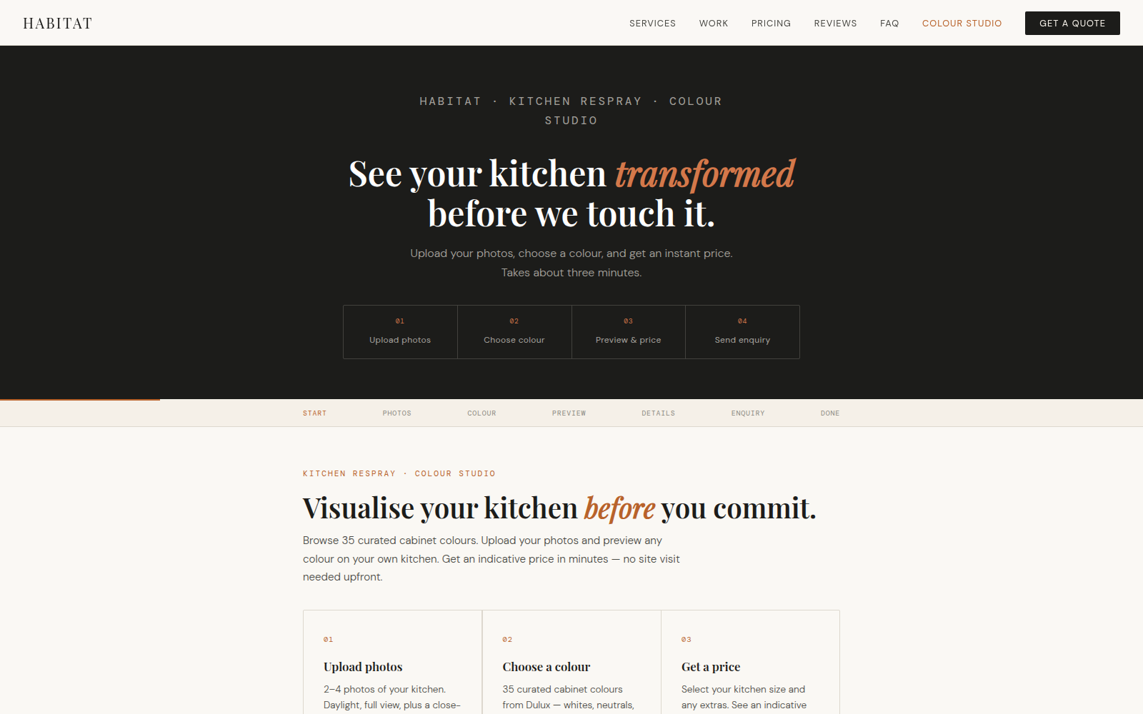
Rather than a generic mockup, the studio applies a chosen finish to the kitchen photo the customer uploads. Seeing the colour on their actual cabinets is what converts hesitation into confidence — and it's far more convincing than any sample card.
02
A curated, filterable palette
A library of professional cabinet colours is organised by family and made filterable, so the customer explores without being overwhelmed. The choices are framed the way a finisher thinks about them, not as a wall of random swatches.
03
Indicative pricing built into the flow
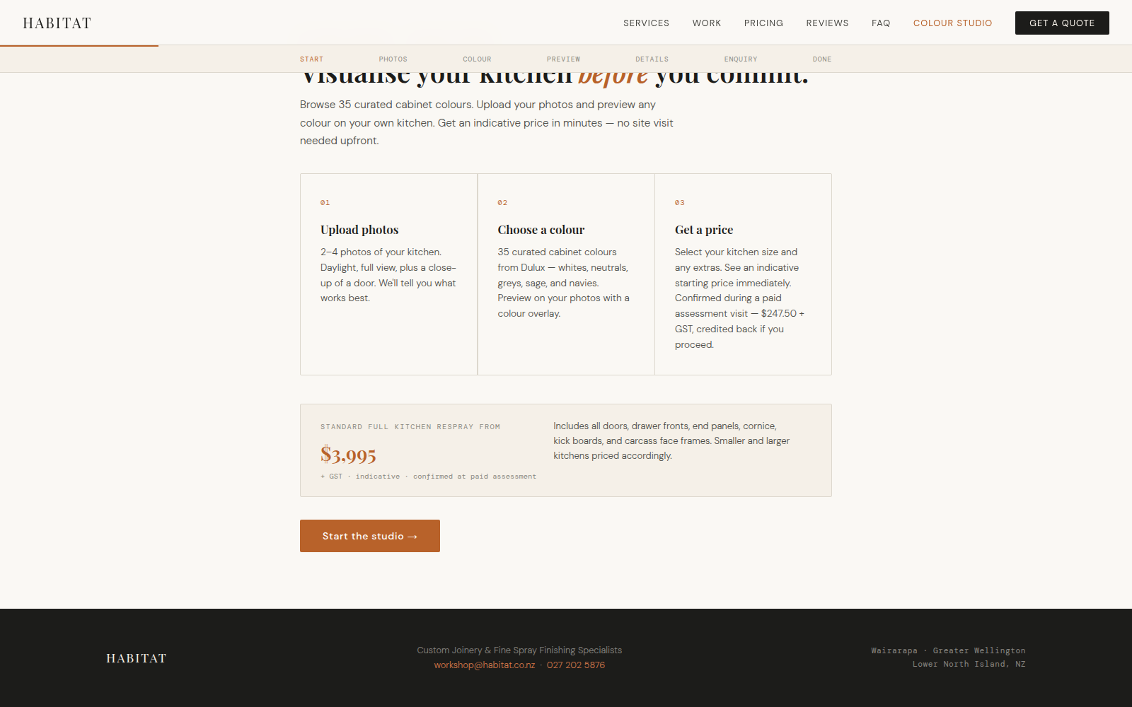
The customer picks their kitchen size and sees an indicative price, with optional extras, before they ever make contact. By the time they enquire, expectations are set and the conversation starts from a realistic place.
04
A multi-step tool that qualifies as it guides
The studio is a guided sequence — upload, choose, size, extras, enquire — and each step quietly captures what's needed to qualify the lead. The customer experiences a helpful tool; the business receives a structured, ready-to-action enquiry.
05
Straight into the job workflow
A completed enquiry flows into the ServiceM8 Website Enquiries queue with a confirmation to the studio, so a lead generated at midnight is waiting in the work pipeline by morning, with the customer's choices attached.
06
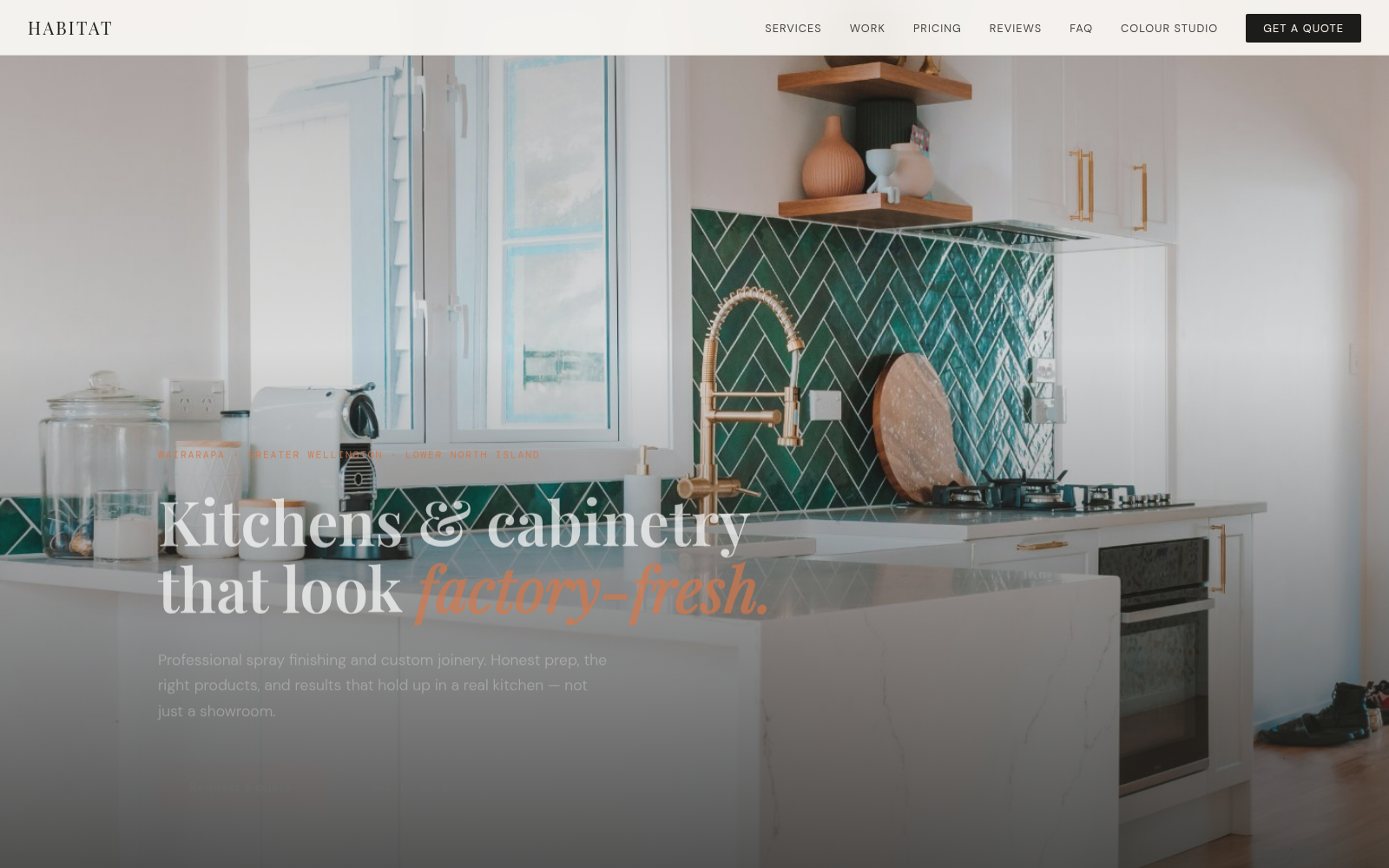
Brand and positioning as a deliberate filter
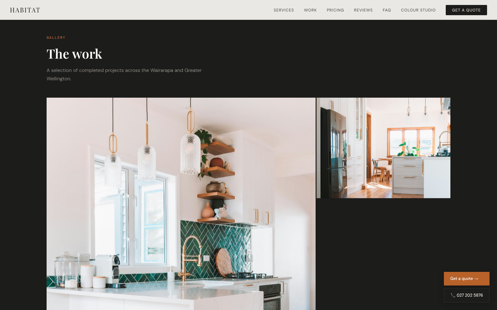
The whole site is built to attract clients who value quality over price. The premium aesthetic isn't decoration — it sets expectations and filters the audience, so the enquiries that come through are the right ones.